World Building

city concept 3    DSC01001

World building is something that I’ve been fascinated with for years. From game design to creative writing it is quite literally the building blocks of all fantasy and fictional worlds. Between my film and illustration projects I will be exploring the idea of world building as I see it, from research to concept; map design, characters, location and inspiration to name but a few. Although I am essentially an artist and set designer I have an interest in writing and all forms of narrative such as game design. There will be posts that focus on all types of world building as well as visual inspiration.

Oni Demon internet     DSC00299

So whether you’re a concept artist, writer or budding production designer you should find something that suits all narrative research. It’s worth following the blog and also looking back over my MA work as there are many relevant entries about science fiction film and set design.

Categories: General research, World building | Tags: , , , , , , , , , , , , , , , , , , | Leave a comment

A little note…

Just to let you know that I will be posting my new film and art projects here very soon. I’ve decided to combine my film design, visual art and other creative work together in one place as I am a cross-over artist and use many different forms of creativity to reach a brief or personal project.

This image is a little taster of some of the film locations that I have visited this year.

DSC_0206

Categories: Working as a Production Designer | Tags: , , , , , , , | Leave a comment

Books Versus Film and My Final Project (The Tube Riders)

As a separate part of my project review I wanted to not only share a handful of the designs from my novel to film project with the wider world but look at the book versus film scenario.

We’ve all heard the phrase “yes I saw the film but I preferred the book”. I see these comments posted regularly on social networks, but why is that?  As readers we have a personal experience when we read a book. The author will guide us and entice us with their own vision, but that doesn’t mean we all see the characters or locations in exactly the same way as another reader or even the author. Novels allow us to get inside a characters head whereas  film, by comparison,  can be more selective. It’s probably because we spend so much time with these fictional people. A book can take anything from a day or two to several months to read depending on the reader compared to a film which is normally set around 2 hours.

Perhaps it’s unfair to compare the two given the time constraints for film makers to produce a believable world. All we can do is to strive for the very best rendition we can, using the best technology, scripts, actors, talent available. Some film versions are better than others for this reason. In many cases some novels are just more adaptable.

My own opinion is that films and books should be treated as two separate  experiences, after all, there are a lot of people who don’t read. Films allow a window into an author’s mind albeit for a few hours and makes a story accessible to all.

What’s important is a good story and a set of characters that an audience can relate to.

For this reason I chose The Tube Riders by Chris Ward. Immediately I was drawn into the world from the first page. There was a great blend of character insight and world building without being too caught up in unnecessary verbal clutter. It also had the right pacing for a film and fell into the science fiction/horror/dystopian genre that is currently popular in both film and TV. Given the time constraints of the project I concentrated on a couple of settings and also worked on some visuals as future guidance for VFX. Working without the normal set up of director/art department/producer I had to make my own decisions through discussions with my tutor. I also used some artistic license as there was no screenplay to work from.

The purpose of this post is to firstly share my work, maybe get some opinions or comments and secondly to hear from those who have read books and seen them transformed into films. What are your experiences negative or positive? Feel free to comment below and let me know what you think about the designs or the subject matter.

tube riders visuals

Below are some photos of scale models for the Medical Research Centre reception area and arena.

DSC01001

DSC01047

arena render 4


The book can be found at:-  http://www.amazon.co.uk/Tube-Riders-Trilogy-ebook/dp/B007LVFSP8/ref=sr_1_1?ie=UTF8&qid=1409468188&sr=8-1&keywords=the+tube+riders


Categories: General research, MA Practical Project, MA project | Tags: , , , , , , , , , , , , , , | 7 Comments

A Reflection on Skills and The Future 1

Part of the MA process was to gain knowledge and skills through the realisation of a practical project. Because of this I thought that I’d take stock of what I’ve learnt so far and understand where I am heading in terms of the next 6 months particularly in regards to skills and software.

The practical work allowed me to transform some of my existing skills with the use of software, introducing me to a more digital design approach.

My original plan was to learn several programs that were industry standard but given the time scales and the vast amount of knowledge I had to catch up on I had to focus on one or two. The obvious choice was Photoshop and digital painting. Photoshop is an industry standard software; every design company uses it from graphic design through to game design. It is also used in conjunction with so many other 2D and 3D applications. Photoshop allowed me a stepping stone into digital design. It also worked well with my more traditional drawing skills. As I had spent  years painting canvases and using a similar layering technique with paint and collage papers, switching the style to digital layers made a lot of sense, especially when I could create similar effects using photography textures and semi transparent digital washes like watercolour paints.

This is an example of a canvas that I did and a Photoshop collage banner to compare.

into the woods sml    banner a

What makes Photoshop so good is that you can save it in various stages of completion, use them again or alter colours, do different versions of the same image etc. It allows you to erase mistakes easily compared with traditional painting, especially watercolour. It’s also much faster when having to work to deadlines. To fully utilise Photoshop’s abilities in film and TV design I need to combine it with other software such as Illustrator, Maya, Z brush etc.

Currently I feel there are 2 possible routes into the art department, Concept art and model making. At the moment I feel that concept art is probably my strength  so I will now look in detail at the job specifics and types of software used at the pre-viz stage. I will also look at the gaming industry and character design and see where I need to improve in regards to skills.


Categories: MA project, Reflection and future | Tags: , , | Leave a comment

Additional Visuals

I worked on an extra visual for the reception space to show more detail and colour for some of the walls and screens. These colours and textures will echo the rest of the space.

rec wall visual final


As the image was taken from the technical drawing of the space I left the right hand side to show the original drawing/ white card model. The left side is the theoretical colour render with brushed aluminium and the blue acrylic screen that will be coloured from behind using a thin plastic for a semi-opaque finish or sprayed with a thin paint to frost it. This will then be lit from behind to provide some subdued light.


city concept 3

This visual was a continuation of a previous image that I started that shows the city as a whole. The lighting and colour are very much the same as the street alteration, hues of green and orange, keeping with the murky theme for all exterior scenes. The architecture is rough so this is something that I’d like to continue to work on over the next few months.

Categories: MA Practical Project, sketchbook and visual diary | Tags: , , , , | Leave a comment

Street Alteration: Final stages and set dressing

elements of street dress

After working on some of the CGI background and graffiti I needed to turn my attentions to the actual set dressing that would  include rubbish, signs, a burnt out car and dirty streets in general. I designed a replacement sign for the fish bar above and changed it to the burger bar in the story. I also needed to dirty the brick work of the existing buildings, board up some of the windows with designed wooden boards. The background also included an abandoned train carriage. This was collage’d in from a photo and would be part of the CGI background. The car was also collage’d in but would be a set dress rather than CGI.

street alter with shop windows a

Theses pictures show the addition of set dressing components as they were added.

Below picture shows the dirtying up of the building fronts.That would be done using water-based paint so it can be removed easily. It also includes the burnt out train.

street concept stage 4

Below the image shows the addition of some fly tipping on the far right and the burnt out car. I have also added some street lights as it’s night and one or two of the buildings are inhabited.

street concept car lights

The final stages were about filling the street with bags of rubbish that hadn’t been collected, loose rubbish and papers, alteration of lighting and just generally blending and tidying the image. I also added a larger bin into the foreground and some blending of the figures so they fitted the scene.


street concept car rubbish 3


Final stage from this….

alteration 1

….to this.

street concept final orange

The final image.

The street alteration needed to look like a dystopian society that had a more post apocalyptic feel. The city is generally uncared for, rubbish is left, people are rioting and setting fires. But the streets are still inhabited, so that meant there had to be life and places where people lived and worked. There is a burger bar, there are places in the city that will sell cigarettes, papers etc albeit limited stock. It was about creating a scene that incorporated CGI and potential post production techniques as well as traditional location scouting and set dressing.

The visual needs to portray the background to pass onto the digital matte painters. It will also need some visual effects due to movement in the background of search lights, maybe a moving train, movement in the clouds etc. to create a dynamic, believable scene.

There were some other items that could have been added such as a shopping trolley, dead flowers etc. I tried adding the shopping trolley and some more piles of rubbish and it started to look a bit too staged, after all it is a street that is still used with people running a business or a shop albeit dirty and run down.

I decided to keep the sky a murky orange green to show the fires off in the distance and the pollution. In heavily built up areas skies do take on an orange glow, this of course is emphasised for this scene.


Categories: MA Practical Project, MA project, Post Production, post-apocalyptic film and design, sketchbook and visual diary, The production designer and art department | Tags: , , , , , , , , , | Leave a comment

Completed White Card Model: Reception with green screen

My reception space used green screen to extend the height of the set so I decided to show on the model where it would be placed in relation to the  action. In the actual space it would be hung from the rigs just feet above but could be also fixed to the top side of parts of the ceiling to secure it. There may also be a need to fit part of it behind lighting so that the space below can get sufficient light to create the right effect. Any lighting rigs can be removed digitally.

DSC01020

DSC01001

DSC00999

DSC01002

DSC01056

The last image shows the green screen position in relation to the set and the rest of the build.

Categories: MA Practical Project, sketchbook and visual diary, The production designer and art department | Tags: , , , , , | Leave a comment

Arena Render: Final stages

I needed to complete one rendered section of a set to show model making skills. These are the various stages through to the final piece. I decided to use a combination of techniques to render the model. The sandpaper provided texture for the walls and floor and printed textures provided the detail for the doorways, lights, ceiling detail and railings. I also used wire, mesh, old jewellery chains and painted cord to make the metal wheel, add detail to railings and for the walkway floor to give a 3D quality to the model.

arena render stage 2

arena render 3

arena render 4

arena render 5

DSC01027 DSC01039 DSC01047


Final images of model complete with some lighting.

Categories: MA Practical Project, sketchbook and visual diary, The production designer and art department | Tags: , , , , , , | Leave a comment

Case Study 2: Discussions With Production Designer Guy Hendrix Dyas 2

I found an interview that shows what Guy Hendrix Dyas thinks about Production Design and the process as a whole. I have selected the parts of the interview that is most relevant to my question and project. The link for the full interview is found below in the references.


Angela Mitchell: Congratulations to you and your team on your BAFTA and many other awards for Inception! How did it feel to be nominated for an Oscar for the first time?

Guy Hendrix Dyas: It was exciting for us — it’s a rewarding experience, and it encourages everyone to keep producing the best work they can. It’s always nice to get a pat on the back from your peers. You have to learn to appreciate those moments.

Angela Mitchell: What do you think is the biggest misconception people have about being a production designer?

Guy Hendrix Dyas: The biggest misconception is that it’s simply about creating sets — production design is very abstract to those who don’t work in the film industry. In my experience, however, the designer is the director’s key ally when creating the look for a film, along with the director of photography. We’re asked to create much more than just sets, we create entire worlds and time periods. It’s very exciting.

Angela Mitchell: You started out doing industrial design, and then an incredible amount of work as an illustrator before concentrating on Production Design. Do you still ever use any of that industrial design foundation in your work today?

Guy Hendrix Dyas: I’m very grateful to have had solid training in industrial design before I even set foot in the film world. Not only did it allow me to develop a very practical design sense but it also made me strive for realism no matter the genre of film I’m working on — fantasy, historical, contemporary. That training was also a great way to learn everything there is to know about manufacturing and construction.

Angela Mitchell: When did you know that production design was going to be your calling?

Guy Hendrix Dyas: While in art school, I attended a film lecture series called “Grand Illusions,” and it opened my eyes to the behind-the-scenes of filmmaking, and the various careers open to those of us who come from a design background. I’ve always loved art and films, and as a student I was an avid filmgoer, seeing every movie I could, and always taking notice of the production design.

Angela Mitchell: When it comes to the work of other designers, which do you admire?

Guy Hendrix Dyas: I try and see every film I can, and a wide variety of genres, so there are many contemporary designers that I admire. From the large-scale designs of Ken Adam, Stuart Craig and Dante Ferretti, to the more intimate work of designers like David Gropman, Mark Friedberg,Timmy Yip and Ben van Os. But truthfully, it’s hard to name names because my list goes on…

Angela Mitchell: It seems to me that, just from reading the script, Inception would be a designer’s dream, a real playground. One of the many things I loved about your job for Inception, was how balanced it was, visually, between structure and chaos. How tricky was it to find that balance?

Guy Hendrix Dyas: Inception had many challenging sets to build, but it also offered us many wonderful design opportunities, while having to accommodate some extremely intricate action scenes and stunts.

For example, to create the illusion of weightlessness during the fight sequences in the hotel corridors and rooms, several identical sets had to be built. Each one was created for a specific shot and had a specific orientation and rotating capability. When these shots were edited together, they became convincing as appearing to have been shot on a single set.

With the scope of a film like Inception, also come the logistical challenges. We shot back to back in five different countries. We got used to the 16-hour days and being on planes every 48 hours!

Angela Mitchell: Was Escher’s work a deliberate inspiration for some of the Inception set pieces? What were some of your visual inspirations for the film?

Guy Hendrix Dyas: Escher and Penrose Staircase were directly referenced in our script. In the film, our Penrose steps are based on an optical illusion [the Penrose Staircase], made famous by Escher’s drawings — an ever-ascending staircase that can never be built or made functional in the real world.

Which is why it took us many hours of research and development to create the set that you see in the film. There’s practically no CG used to shoot the scene, just some support removal and clever camera work.

Angela Mitchell: Designwise, in Inception, it seemed to me that there was always this beautiful and very clear visual contrast between the linear and chaotic, and between tension and release — for instance, in the gorgeous hallway sequence you mentioned earlier, where Joseph Gordon-Levitt battles a bad guy in 360 degrees! What scene or moment presented your favorite challenge for the film?

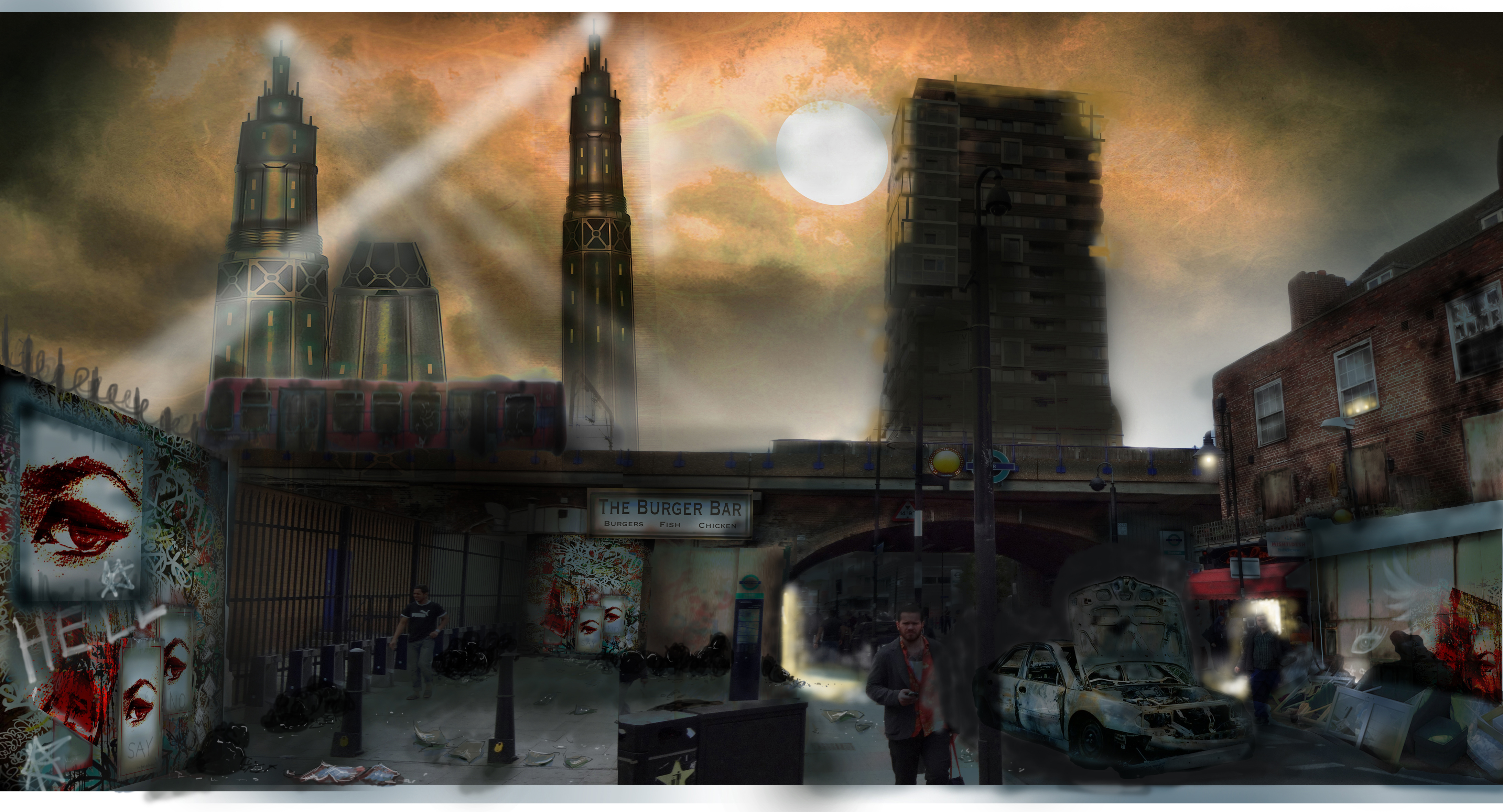
Guy Hendrix Dyas: One of the most challenging sets to build was the snow fortress for the end sequence, because we chose to shoot it in a remote area in the high mountains of Calgary. Chris Nolan uses CG very cleverly and for Inception, he didn’t want a film primarily using digital backgrounds. So very early on, Chris and I made a crude clay model of this set, as he wanted to create something akin to what he’d seen in some of his favorite Bond films. That’s how we came up with a mix between military architecture and Panopticon prison design for the snow fortress, our concept being to never really know who is the observer and who is being observed.

It quickly became apparent to us that this set would have to be divided into two separate builds. The interiors would be built on stage in Los Angeles, while the multi-level exterior would be built at approximately 20,000 feet on a mountainous site we scouted in Calgary.

We started building the exterior set with a Canadian construction crew in late summer, right after returning from shooting in Morocco, in order to have it completed before the heavy snow set in for the winter. We were very conscious of this location’s natural beauty, so we avoided using concrete foundations. Instead, to anchor the set, we dropped large wood posts into foundations filled with water and let them freeze into place.

Angela Mitchell: It’s terrific that you were able to take such care for the natural environment there.

Guy Hendrix Dyas: Despite a few blizzards, we were really fortunate to have perfect weather conditions, and during the shoot you could actually see the real snow blowing across the set, and the amazing mountains behind it. It was a testament to how great it is to be able to shoot on location, with real conditions.

Angela Mitchell: Set decorator Douglas A. Mowat was also nominated alongside you for the Art Direction Oscar this year — how do the Production Designer and Set Decorator typically work together?

Guy Hendrix Dyas: A good example was the work we did on the Japanese castle sets. As per our script we knew that Saito, Ken Watanabe’s character in the film, would be imprisoned in a castle, but to me it made sense that it would be a Japanese castle. This gave my set decorating team and I a chance to create a subtle, dreamlike quality, especially when it came to choosing colors, materials, lighting and furnishings.

Angela Mitchell: There’s a definitely a richness, glow, and texture to all the scenes there. It’s very tactile.

Guy Hendrix Dyas: The hundreds of lanterns strung along the ceiling were based on something I’d seen in Japanese temples during certain traditional holidays. It was a way to add interest and warmth to this scene without cluttering the space. Our furnishings were minimal because the painted gold leaf murals and the glow from the lanterns were all that Japanese dining room really needed to come alive.

Angela Mitchell: What was it like to work with Christopher Nolan?

Guy Hendrix Dyas: It was a great experience, I learned a lot, and also felt I was given the freedom to contribute as many ideas as possible for each set. Chris is a great leader, and that’s what you need on a technically complicated film like Inception.

Angela Mitchell: What are the challenges involved when you’re designing for an existing franchise, like X2: X-Men United, Superman Returns, or Indiana Jones and the Kingdom of the Crystal Skull? I loved the way you managed to open up those worlds and give us these very different looks and feels, from the school attack in X2, to Lex Luthor’s yacht, to the inside of the pyramid in Indy…

Guy Hendrix Dyas: I think one of the most important goals of production design is to be able to satisfy a story and a director’s vision, so by definition this means that every film should be a completely new experience. Directors are really the ones guiding the way, and our aim is to bring their visions to life. Even when working on existing brands or franchises, I hope that my designs appear as different as the films and stories being told.

If there’s a constant, it’s perhaps the fact that every film is a learning process, and that for designers, it’s nice to be able to take each experience and the things you feel were the most successful into your next assignment — after a while, you start assembling your own personal bag of tricks.

Angela Mitchell: If you were going to advise a roomful of production design hopefuls, what would you say to them, and what mistakes would you caution them to avoid?

Guy Hendrix Dyas: I think we all make mistakes. That’s part of the learning process. But if you love your job on a day-to-day basis and you’re passionate about what you do, you’ll find a way to make it work.

Also, the challenges for me never come from the actual act of designing, but rather from the time and budget constraints. Although in many ways, smaller-budget films aren’t always harder to design than big-budget films.

Angela Mitchell: That’s really surprising.

Guy Hendrix Dyas: Because everything is proportional. A film that has ten times more money will usually have ten times more to create, and ten times the expectations to meet. Studios and producers simply don’t give you free money no matter the size of the production — everything is carefully accounted for, and bigger is rarely easier when it comes to films. I think that’s a common misconception.

Angela Mitchell: Do you typically sketch things out by hand in your design process, or on computer – or a combination of the two? What tools do you typically use?

Guy Hendrix Dyas: People in films seem to come from all walks of life, but in my case, the many years I spent at art and design school were very useful, as I draught, sketch, paint, sculpt and make models.

For each film, I sketch as much as possible — not only because I enjoy it as a design process, but because it’s still the best communication tool. Then, if time permits, I try to take my pencil sketches into color – however, more and more, I also work with a great team of illustrators who help me assemble the visuals we need.

Angela Mitchell: How do you approach each new film project — do you have a specific process each time?

Guy Hendrix Dyas: I think I approach each new film in the same way other designers do, in that I try and sketch out as many ideas as possible while also researching as much as possible – everything from the subject matter, to the architecture, to reading relevant books, watching documentaries, and visiting museums. I find those early days of preproduction very enjoyable, as you’re able to let your imagination run wild, and everything is still possible.

Angela Mitchell: Among the movies you’ve worked on, which were most satisfying for you, from an artistic standpoint, where you looked at the film and said, “That’s exactly what I wanted it to look like?”

Guy Hendrix Dyas: As your design credits accumulate, it’s true that one can start to discern patterns and preferences, but I’ve tried to avoid typecasting as much as possible. I’m excited by a variety of projects, and I think I’ve been able to break the mold by not always doing films considered to be big Hollywood films. Right after X2, for instance, I joined Terry Gilliam on The Brothers Grimm in Eastern Europe. I find those transitions healthy — every film is a new beginning.

Still, more often than not, the projects that come your way, and that you end up working on, are due to coincidence and lucky timing more than anything else. For me, every film is satisfying, it’s always as interesting and as visually pervading as you and the director want to it to be.

I feel very fortunate to say that all the films I’ve designed so far have brought me unique and wonderful experiences, and each in its own way has been my favorite. However, like many people in this industry, I try and keep my eyes on the road ahead — my hope is always that the best experiences are still to come.


“The biggest misconception is that it is simply about creating sets”

Dyas continues to confirm and also echoes some of the ideas of Alex McDowell in the fact that the role of the production design is abstract and doesn’t always work in a linear form. Again, it’s very much about world building and seeing the story as a whole.


“Chris Nolan uses CG very cleverly and for Inception, he didn’t want a film primarily using digital backgrounds. So very early on, Chris and I made a crude clay model of this set, as he wanted to create something akin to what he’d seen in some of his favorite Bond films.”

Another example of using traditional techniques in a technologically advanced film. They used a location to get the right feel and again used visual metaphors of being watched.


“Also, the challenges for me never come from the actual act of designing, but rather from the time and budget constraints. Although in many ways, smaller-budget films aren’t always harder to design than big-budget films.”

Here he discusses the budget, saying that the design is proportional to the size of film and budget. Budget will also play a large part in the production designers role at the early stages of film design. This will sometimes affect whether a set is built, location is used or a whole view is CGI. Titanic used a scale model to create a set, then CGI’d it in behind the actors instead of building a room for budget reasons. I had no budget to work with so designed the set to be built. This could of course been a CGI background or a model. Should the budget require that, It could easily be achieved using traditional methods of model making with advanced CGI to place the action into shot.


“I think I approach each new film in the same way other designers do, in that I try and sketch out as many ideas as possible while also researching as much as possible – everything from the subject matter, to the architecture, to reading relevant books, watching documentaries, and visiting museums ”

This is an important statement in terms of what the designer does at the pre-production stage in that the process is entirely immersive in terms of research.


It’s clear from what I have seen of Guy Hendrix Dyas’s work that he is involved from the start in what the film will look like right through to the set extensions and CGI. He provided a visual foundation for the overall design of the film, from researching the architecture through to locations, then on to how the CGI would be incorporated. Where traditional processes were needed or wanted, he was involved in their design. CGI is a tool like any other so providing that visual source material at the early stage of design is important in films that have so many concepts and needs to use multiple post-production techniques. Films like Science fiction and fantasy will always have challenges and having technology that speeds up the process can only be a good thing as it means the designer can oversee at the whole picture at a much faster pace. The important point to note is that post production/CGI etc. does not become a distraction and that it supports the design rather than becomes  a way of life.


Interview references:-

(MITCHELL, A., Production Designer Guy Hendrix Dyas on the Challenges of ‘Inception’) Available at:-

(http://performingarts.about.com/od/Costumes/ss/Inception-Production-Designer-Talks-About-Designing-The-Films-Dreamscapes.htm) [Online: sourced on 17/05/14]

Categories: Case Studies, MA project, Post Production, The production designer and art department | Tags: , , , , , , , , , | Leave a comment

Case Study 2: Discussions with Production Designer Guy Hendrix Dyas

Guy Hendrix Dyas discusses aspects of the design for Inception:-

Dyas also pointed out a telling sign of Nolan’s directorial philosophy: if you look at the accompanying image, you will see scaffolding supporting the stairs. Most other directors would use a green screen to create the effect: Nolan wanted the stairs built, and then used visual effects only to remove the scaffolding and complete the illusion. “Only about 5 percent of the scenes in this film actually use green screen,” Dyas says. “You’re talking about a film that has real rotating corridors, elevator shafts that were built sideways in warehouses so that it would appear 300 feet long. We have tilting bars, real trains smashing into cars.”  Guy Hendrix Dyas discussing design for Inception(LOPEZ, J., 2011)

cn_image_1.size.inception-stairs

Image available at http://www.vanityfair.com/online/oscars/2011/01/inception [sourced on 17/05/2014]

In a film that is so ground breaking in terms of CGI and  post production techniques the statement that only 5% of scenes were green screen is surprising. It’s an important point to make when looking at what the designer has to do at the pre-production stage when dealing with the newest technology; that green screen and CGI is only used when really needed.

The early stages of Inception’s design process started in Director Christopher Nolan’s garage with Dyas creating a 60 ft scroll depicting the history of 20th century architecture. This became the foundation for the design of the film because architecture was so important to the overall ideas surrounding the story. It was all about building landscapes within the dreams of the main character and reflecting his state of mind. Much of this was done through the architectural landscape that they inhabited  with scenes depicting DiCaprio’s character.

“You’ll notice at as it stretches back, the buildings get taller. I imagine Cobb and his wife started off on the beach, building buildings that were homages to their heroes of architecture. As they built more and more, they were building their own 3D museum of the most stunning architecture.” Discussing how the architecture influenced the film (LOPEZ, J., 2011)

When Cobb returns with Ariadne to the dream city, however, they find it in total disrepair—again a design concept with a specific idea behind it: “The mere fact that they were eroding away into the sea, and the sea was eating into these buildings, was another visual method of showing that he was losing his mind,” he says. Dyas and Nolan discussed the look and feel of architecture that had been abandoned, specifically at the site of the Chernobyl accident, and had the good fortune of coming across a housing site in disrepair during a drive around Tangiers, which became the final set for the abandoned dream city. (LOPEZ, J., 2011)

The film is full of metaphors and symbolism such as the crumbling buildings representing the loss of mind. Visual metaphors are another aspect of design that is discussed at the pre-viz stage of production. It’s important that the visual clues match the story that is being told, whether they are subtle or not. Inception was full of these visuals such as the maze like Penrose steps; a Escher inspired set that was actually built in reality. This was to echo the ‘fetish-like obsession with stairs.

“We went through 12 different physical cardboard models of the Penrose steps before we came up with something that worked,” Dyas says. “Once we did that, we created a digital model and started looking at what camera lenses would make this look like an Escher painting. Only then did we start building a staircase. Dyas discusses the steps. (LOPEZ, J., 2011)

They continue the maze like feel of the film with many of the interiors such as the Great Hall, with levels and steps and included other visual symbolism such as the use of lanterns. Dyas pointed out that in Japan lanterns are a symbol of lost souls, so this was incorporated into the design.

cn_image_2.size.inception-temple

Image available at http://www.vanityfair.com/online/oscars/2011/01/inception [sourced on 17/05/2014]

What’s important to note at this stage is that design is not all about creating a set for the actors to inhabit, it’s also about world creation and visual pointers to what the Director envisages ultimately what the characters are feeling, how that translates on-screen. In my set design I wanted the government buildings such as the Medical Research Centre to have a clean, more ordered feel compared to the dirty streets of London. It needed to feel imposing in some way. There is also a claustrophobic feel to the entire film. The research centre is underground and had to feel like that. I kept the colours to cool blue and grey hues for the interiors apart from the arena space which has a blend of future and medieval, though the future has almost reverted back to the past in many ways. Outside, the streets have an urban look that uses green/brown colours. It’s organic but dirty and uncared for. The Medical research centre also has a church like feel with eyes being drawn upwards towards the laboratories and levels above. Science playing God. The arena that houses the Huntsmen being even deeper could be viewed as a form of hell. My street alteration also incorporates elements of symbolism with the use of eyes in the graffiti and wings of a dove. I am trying to create a cluttered suppressing environment in which you feel that you are being watched. The towers in the background with the search lights add to that, creating a prison like environment. In the book, London is walled in, no one can leave and they keep the cities and the countryside apart.

Looking at the practicalities of set building my walkway would be constructed with scaffolding very much like the Penrose steps in Inception. This would be clad but should the walkway need extra support, scaffolding poles could be CGI’d out. This would be an effective way to use CGI instead of creating an entire set digitally. Only using the technology where it is needed.

The early stages of film design are not just about research and sets, it’s about the whole philosophy of the film, world building, subtle visual messages etc. These aspects are discussed at the pre-production stage, whether CGI is used or not.


References:-

LOPEZ, J., Inception Production Designer Guy Dyas: “Only 5 Percent of Our Scenes Used Green Screen” Available at:- http://www.vanityfair.com/online/oscars/2011/01/inception. 2011 [Online-sourced on 17/05/2014]


Categories: Case Studies, MA project, Post Production, The production designer and art department | Tags: , , , , , , , , | Leave a comment

Blog at WordPress.com.